Ohio COVID-19
Note: this page has been optimized for curiosity and the ability to change views/demographics. Therefore, it does not translate well on tablets or phones!
We had two primary goals when we started studying COVID data. Our primary objective was to create an unbiased view of the data that could be helpful for the mental health and strategic planning for our team, our clients and our community. A second objective was to challenge our team’s data skills and if possible, show off our talent.
For as long as this data is made publicly available, we plan to update these charts on a weekly basis. All analysis is based on data provided by the Ohio Department of Health.
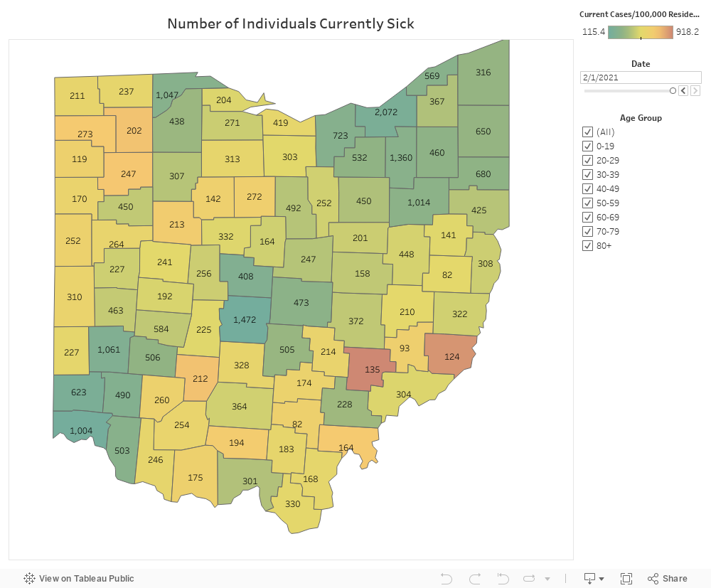
Number of Individuals Currently Sick
The chart below identified the number of individuals deemed to be “still sick” at any point in time. “Still sick” is determined by calculating the number of individuals who are within 21 days of their onset (test) date1, and who have not been hospitalized.
Feel free to get curious by selecting different age groups or changing the date to see different trends in the data. The heat map is determined by indexing the “still sick” individuals by population size (i.e. still sick/100,000 residents in the selected age demographic).
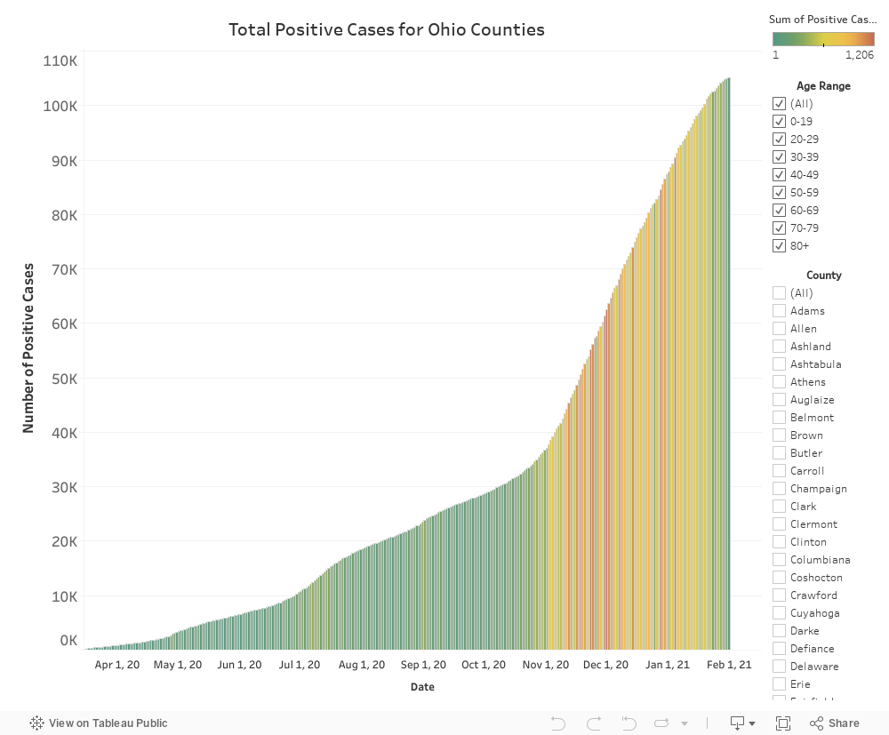
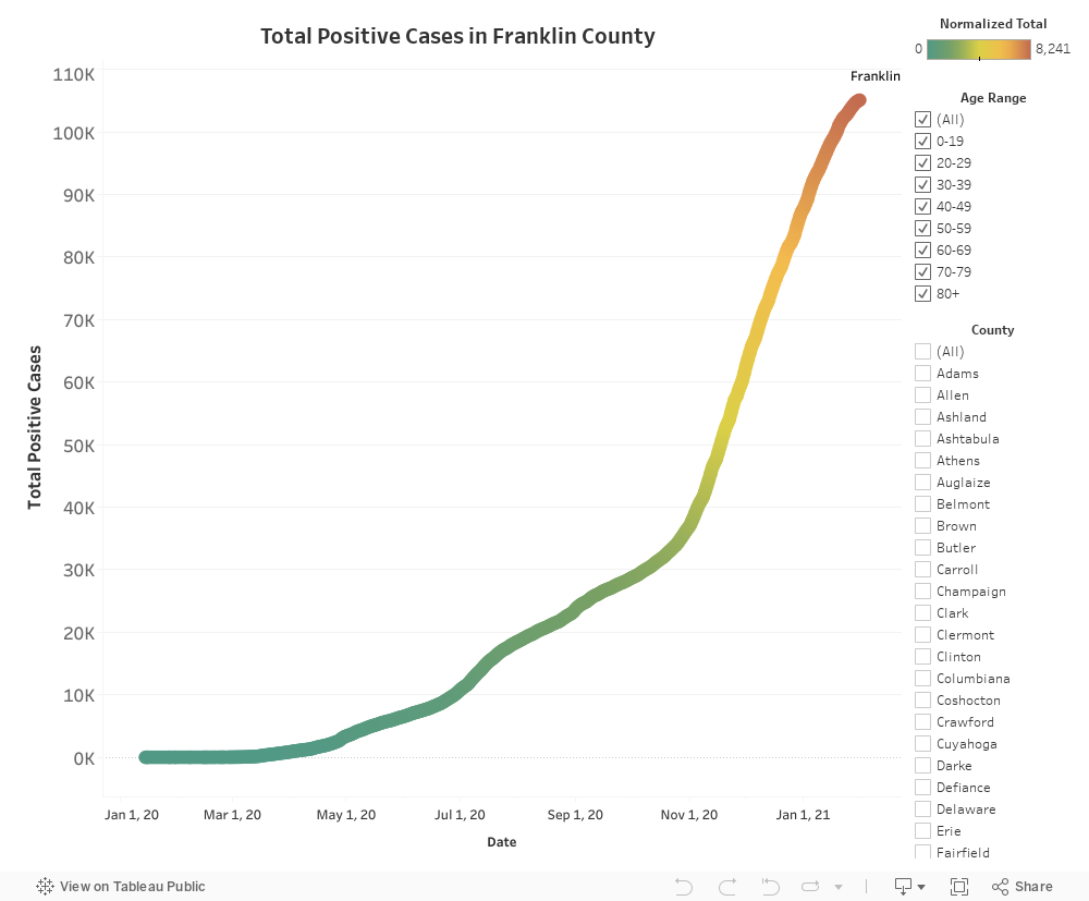
Total Positive Cases for Ohio Counties
The chart below shows the aggregate total of positive tests reported by the State of Ohio over time. You can change this chart by selecting different counties or groups of counties. You can also change the age ranges to see different perspectives. The heat map of this chart is determined by the proportional increase of new positive test cases in a given day.
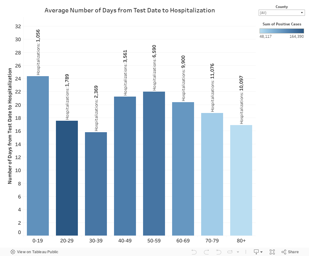
Average Number of Days from Test Date to Hospitalization
For individuals who are hospitalized, the chart below displays the average number of days from onset (test) date until a patient is hospitalized by age group. You can get more specific by selecting different counties to see the average number of days for each age groups.
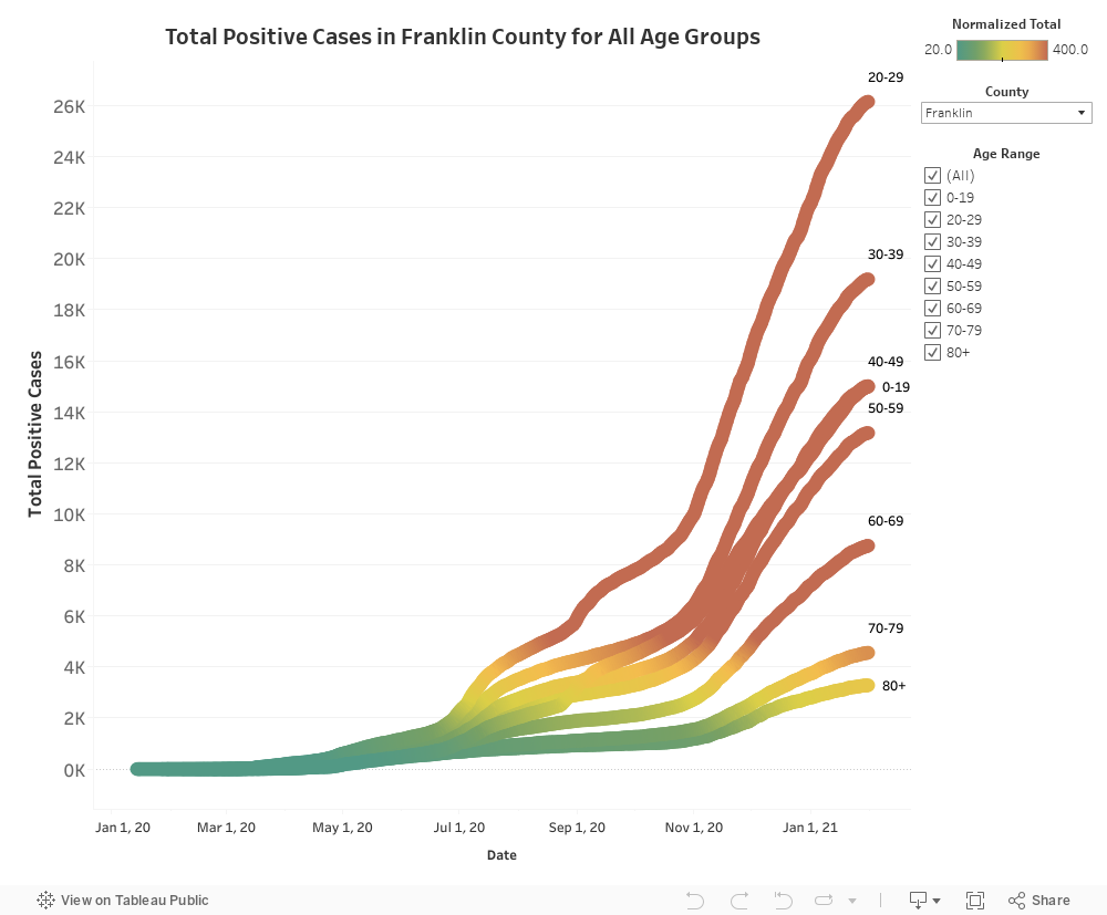
Within County Age Group Total Sick
Within an individual county, the chart below displays the aggregate number of positive tests by age demographic over time. The heat index within each line displays the intensity of positive tests per 100,000 individuals within the population of that segment within the county.
Compare Counties Total Sick
The chart below allows for comparison of the aggregate number of positive tests by age demographic over time for multiple counties. The heat index within each line displays the intensity of positive tests per 100,000 individuals within the population of that segment within the county.
1 For now, we have selected 21 days from onset to today to estimate the number of individuals who are “still sick’. We know that this is a conservative approach, but we did not want to minimize the impact of COVID-19. In July 2020, the CDC published a report estimating that 88% and 95% of patients in the study no longer yielded replication-competent COVID-19 virus after 10 and 15 days, respectively, following symptom onset (CDC, unpublished data, 2020; Wölfel et al., 2020; Arons et al., 2020; Bullard et al., 2020; Lu et al., 2020; personal communication with Young et al., 2020; Korea CDC, 2020).